
Winderful
Winderful visualises the UK’s wind energy in real-time.
It’s an experiment using data to tell stories about renewable energy.
Launched way back in 2013, Winderful was partly motivated by a desire to take some of the issues surrounding climate change – and what we need to do to mitigate it – and make them more tangible and engaging. It feels like there is still a disconnect between the overwhelming scientific consensus, the roadmap to a more sustainable future and how these issues are presented to the public.
We believe that interactive storytelling – turning data into things that people manipulate and play with – is a great way to make a point. If we can help get the messages across a bit more clearly and in a way that fires the imagination, then we’ve achieved our goal.
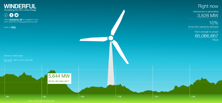
How it works:
The turbine spins faster or slower in response to the amount of wind power currently being generated at that moment (updated every five minutes).
You can also look at historical levels of wind energy supply going back to 2011 by changing the date range.
We wanted to bring the raw data to life, and turn MW into something more tangible, so we’ve translated the big number into day-to-day energy use. Things like powering a home, watching television, making toast and driving an electric car.
We’d like to tweak those metrics to be more meaningful still – so if you have any suggestions, let us know!
Over on twitter, @winderful_uk , tweets, landmark levels of wind energy, as well as providing a “while you were sleeping” nightly update. We’ve also been playing with an Arduino-powered physical representation of the data too, which could eventually turn a physical model turbine, or illuminate a light display.
If you’d like to play with the code and make your own version, it’s available on Github here.
If you have any questions, feedback or suggestions, please ping us at @diascreative or use the contact form.